Monday, March 25, 2013

Eagle 2

Sorry for the delay on this. I've been crazy busy with house projects and I kept forgetting to update.

There isn't much to say about the window installation that wasn't covered in the last post so I will just keep it short and show you some pictures. We are super happy with the outcome and we are looking forward to getting the rest of the windows replaced someday.


I really like that screens cover the whole window. It looks much better than having one dark side and one empty side. 


On the inside we had the option of going with primed or bare wood. We decided to do the insides white since the rooms were white.


The trim in these next two shots has yet to be painted.


Here is a before shot of the back.

Here is an after shot of the back. I think the gray we picked  matches the aluminum really well.


Now that the windows and doors are in it is amazing how much clearer and quieter they are compared to the old ones. Also, it no longer feels super cold when you're standing next to one.

When we had the windows installed we told them that we would be doing the trim work on the inside to save a few bucks. Little did we know that his would lead us in to our next project. More on that soon...


Be seeing you.

Wednesday, February 13, 2013

Eagle 1

We have been talking about replacing the inefficient, and less than functional aluminum doors and windows since we bought our house. We loved the look of them, but the windows are pretty much storm windows, and the sliding doors didn't really slide anymore. Also, you could feel a pretty decent breeze when standing by the windows, so they had to go.

The problem with new windows, other than costing a fortune, was finding something that looked good with the house. Most people nowadays just use white vinyl. That's fine on most houses, but I didn't feel it was right for ours. Sadly, living in the Southeast limits you when it comes to more modern windows that are affordable, especially aluminum ones. After doing some research online we came across a company called Eagle. Their aluminum clad windows definitely catered to the more modern design senses we were looking for. They also came in a large variety of colors at no extra cost. Anodized aluminum was an option, but was pretty pricey. We decided to go with a color called Gray Flannel. It was almost the exact same color as our current windows. It just lacked the sheen brushed aluminum has.

The company we used for the install is called Window Traditions of Georgia. When we went to their showroom the salesman knew exactly what we wanted and didn't try to sell us something we didn't need. He also talked about how he used to install windows in Eichlers so I knew we were in the right place.

We decided to focus on the two sliding doors and 3 windows instead of doing he whole house at once. This was mainly for budget reasons, but I also didn't want to replace every door and window and not be happy with the look in the end. I'm pretty picky when it comes to things that cost a lot of money. Actually, as I am writing this, I am being told that I am pretty picky with everything. That's probably true.

To get things started here are the doors and windows before they were replaced.


Yes that was an allen wrench used to lock the doors


... and that was the huge gap we had to deal with because the doors wouldn't close all the way.

Now that we have seen how crappy the old doors and windows were, lets see the new ones going in.


The old windows were so flimsy they shattered when pulling them out. I happened to walk downstairs as this was happening and just turned around because I was scared to watch.


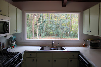
Here is one of our new windows. Doesn't it look nice?


I actually liked having no window over the sink. If i wasn't so cold I would have asked them to leave it like this.


That is the last picture I am going to show. Come back next week to see the final result.

Be seeing you.


Sunday, February 10, 2013

Refinishing help

Hey everyone, we could use a little advice here. We have this coffee table that we really love, but the finish on it is pretty bad.


Almost anything you set on it leaves a hazy looking mark. The clear coat must not have totally cured because it dents easily with a fingernail, and if you leave a book on it for a few days it kind of sticks when you try to pick it up.

So my question is, what is the best way to refinish this thing myself? It's solid wood, walnut I think, not a veneer.  I would like to keep the original color of the table if possible. Any advice you have would be great.

Saturday, January 26, 2013

Shelving Dilema Update

We removed the panelling behind the bar today only to reveal little to no space to work with. So much for recessed shelving. Susan isn't crazy about the wall to wall shelves so we are going to have to rethink this.

If you have any suggestions about other shelving options we would love to hear them.

Shelving Help


One of my projects for the downstairs den is to have some sort of shelving behind to bar. Currently we just have all of our glasses and booze hidden behind the bar which is pretty messy looking and not very practical. We are in the process of taking down the wood panelling so we can insulate and put up drywall down there. I'll post more about that later. Since we are tearing out the walls I thought it might be a good opportunity to create some kind of built in shelving behind the bar.

Here is an old picture of our bar setup.

At first I was thinking we could make built in shelves that would just go the length of the bar, like this.

Then I thought they would look better if they filled most of the wall.

I was also thinking I could skip the recessed part and build a wall of shelves instead.

We are leaning towards recessed shelves because there is not that much space behind the bar. Also, Susan is not a fan of the wall of shelves for this spot. However, I kind of like walls of shelves so we are undecided.

So, what do you think? Let us know in the comments.

UPDATE!
Here is a 4th option we came up with.


Thursday, January 3, 2013

Finial Frenzy!

Happy 2013 everyone! We have an "Our Modern Mess Year in Review" in the works but I felt that this find warranted an immediate post.

Are you a vintage purist who scoffs at inexpensive (or even very expensive) reproductions of designs from the past? Then stop reading now if you wish to hold on to your respect for us, or continue reading if you wish to judge us. Last year for Christmas we bought a vintage finial from an Etsy seller to top our tree.


Ok, that is a terrible picture, but it is already packed away. You're just going to have to imagine that it is really pretty.

Since then I have been very keen to find even more finials. I wanted to have a nice display like this on a table


or even a crazy mantle display like this


It hasn't happened yet. While there are many nice looking vintage finials to be found on the internet, once you add in shipping they start to get a little pricey. Also, they are often lovely in the pictures but not as bright in person. But, as I was walking through JC Penney today I came across this


A bargain hunter's dream! A whole bunch of Christopher Radko reproduction Shiny Brite finials! The tall, thin ones were $8 and the shorter, fatter ones were $10. I bought 4.


The initial plan was to choose one we liked and return the rest but I just don't know. They're all so pretty! I guess you'll have to check back in with us next Christmas to find out what happened. So hurry my finial-loving friends! Get thee to a JC Penney before I go and buy the rest of them